Website animation is the movement of elements on a page: blocks appearing as you scroll, parallax, a button responding to hover and tap, 3D scenes and embedded videos. Good animation explains the product and shows where to tap. Bad animation shifts the layout, slows down an inexpensive phone and can’t be turned off. Three questions test any effect: what does it explain, what load does it put on the page, and what will someone see if their phone has “reduce motion” switched on.
What website animation effects are called
When you write a brief or look for examples, it helps to know the names. Here are the main ones.
| Name | What it is | Where it fits |
|---|---|---|
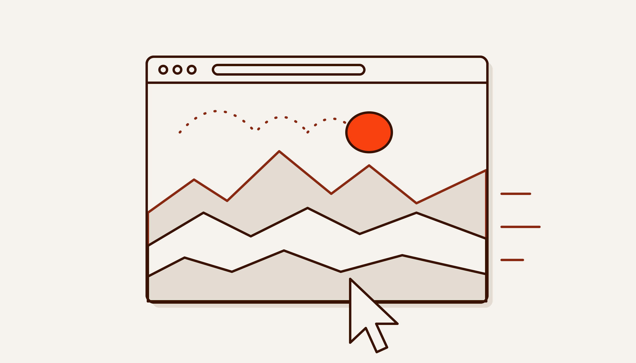
| Parallax | layers move at different speeds on scroll or with the cursor, giving a flat page depth | first screen, product story |
| Scroll animation | animation tied to scrolling: the scene changes as you scroll. CSS has scroll-driven animations for this — the animation runs on a scroll timeline instead of a time-based one | explaining a process step by step |
| Reveal on scroll | blocks and lines enter when the eye reaches them | long pages |
| Micro-interactions | a short response to an action: the button is pressed, the form is sent, the item lands in the cart | forms, cart, toggles |
| Hover | an effect when the cursor is over an element. Phones have no cursor, so nothing important should hide behind hover | cards, links, menus |
| Loader (preloader) | a loading indicator or splash screen while the page loads | only when waiting is unavoidable |
| Lottie | vector animation a designer makes in After Effects, played on the site from a JSON file by the Lottie library | icons, illustrations |
| 3D and WebGL | a 3D scene in the browser: CSS 3D transforms or WebGL, an API for 3D graphics without plug-ins | product showcase, interactive scene |
| Kinetic typography | letters and words change weight, size or position | headline, main message |
“Interactive animation” is anything that responds to a person: to the cursor, a touch, a drag, a scroll. A video that simply plays is not interactive.
Examples: what we built on our own pages
We won’t show other people’s sites. Below are two of our pages where motion is written in code, without animation libraries. Open them alongside this article.
Website development. The first screen is a stack of layout layers. On a desktop the layers shift with the cursor, each to its own depth, and drift apart at different speeds as you scroll. That is parallax. Next comes the “website on a conveyor” scene: a block several screens tall with a pinned scene inside that stays put while you scroll. Five stations — brief, wireframe, design, motion, launch — replace one another as you scroll, and the progress bar stretches via transform. On a short screen, such as a phone held sideways, the pinned scene gives way to a plain list. Further down are five live samples of techniques: parallax, a card tilting in 3D after the cursor, kinetic type, a button that pulls towards the cursor, and lines revealing on scroll.
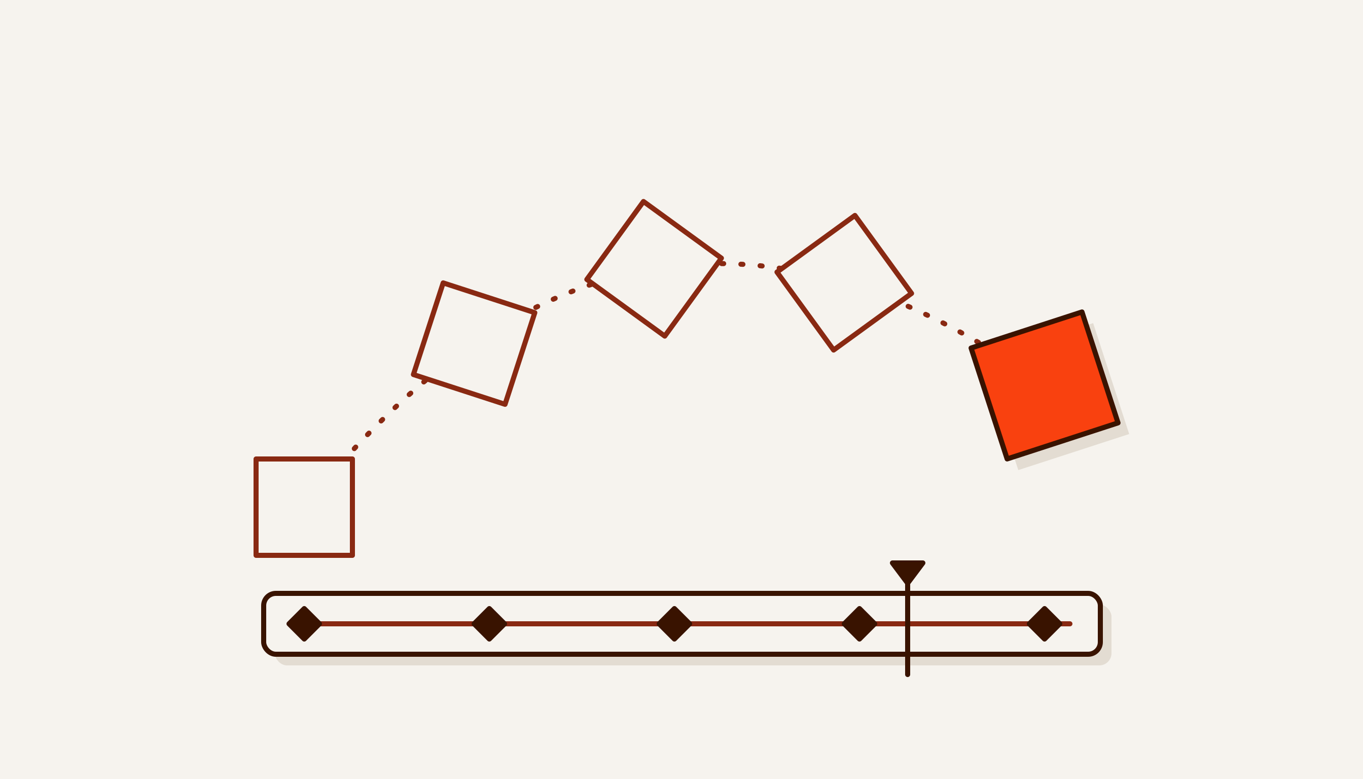
Motion design. The first screen holds a 3D ring of six of our vertical videos, built with CSS perspective. The ring turns slowly by itself, gets an extra spin from page scrolling, and can be dragged with a mouse or finger, with inertia. Tapping the front video opens it in full with sound. Further down is the “editing desk”: five process tracks and a playhead that moves along the timeline as you scroll.
How it is built so it doesn’t slow down:
- Videos load only when the ring is on screen. Each video has
preload="none"and a poster. The source is set only when the ring enters the viewport. Silent loops are 540×960, from 148 to 886 KB each. Full versions with sound weigh 1.4 to 4.9 MB and load only on tap. - Only the front videos play. The rest sit on their posters and spend neither data nor battery.
- Frames are computed only while the scene is on screen. Scrolling merely asks the browser for a new frame. When nothing is happening, the page doesn’t run animation for nothing.
- Cursor effects turn on only where there is a cursor. The code checks
(hover: hover) and (pointer: fine), so on a phone cards don’t tilt after your finger. - With “reduce motion”, everything stands still. The ring doesn’t spin by itself, loops don’t start, the scrolling ticker stops. The content stays the same: posters and playback on tap.
What PageSpeed showed
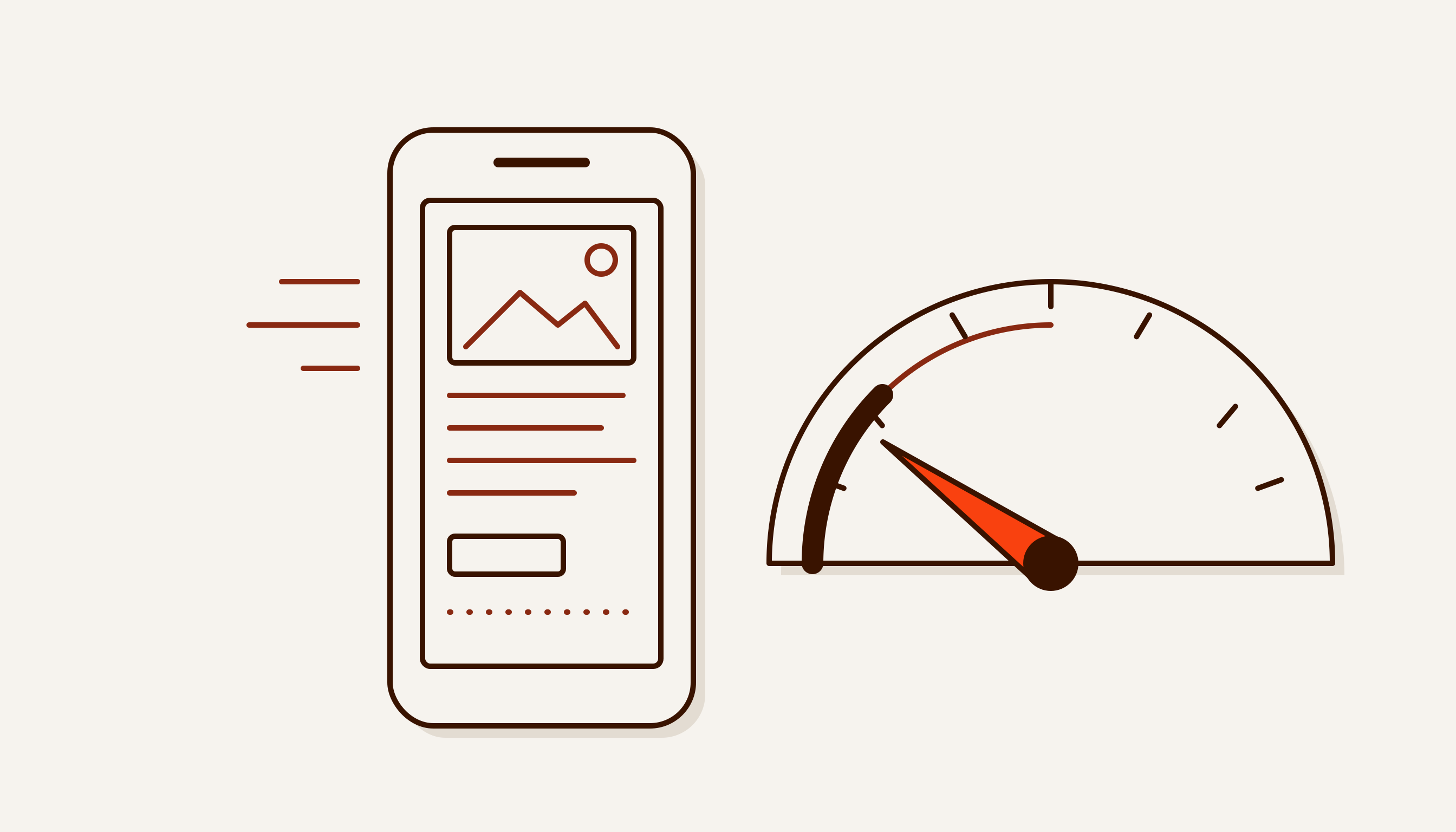
On 1 October 2026 we ran our pages through PageSpeed Insights on the Mobile tab. The home page scored 100 out of 100 with LCP 1.7 s. The Website development page — a pinned scene five screens long, parallax and live technique samples — scored 93 out of 100, with CLS 0.002 and total blocking time 40 ms. The takeaway is simple: a lot of motion and a high score can coexist if you animate transform and opacity, never shift the layout and do not run what is off screen.
Animation on Tilda
On the Tilda website builder, animation lives in Zero Block. According to Tilda’s help centre, it has two modes. Basic animation covers an appearance effect, parallax and fixing. Step-by-step animation is started by one of five triggers: an element appears on screen, a block appears on screen, scroll, hover, click. For a landing page with blocks appearing and simple parallax, that is enough. Effects beyond those triggers, such as dragging a scene with a finger with inertia, have to be written in code. How a builder differs from a coded site is covered in Tilda, WordPress or a coded website. The rules below are the same for any tool.
What helps sell and what gets in the way
| Helps | Gets in the way |
|---|---|
| a scene explains how the product works | animation for its own sake that explains nothing |
| the button responds to a tap, the form shows “sent” | a 3-second loader before every page |
| the headline and button are visible at once, motion loads later | the first screen stays empty until a script loads |
| a block reveals itself without pushing its neighbours | elements jump, the button slides away from under your finger |
| video plays muted, sound on tap | autoplay with sound and a heavy video background |
| the ticker and carousel can be paused | endless motion with no pause |
Performance: what to animate and what not to
The main rule in the web.dev guide is to animate only transform and opacity. The browser handles these at the compositing stage, without recalculating layout. Properties such as top, left, width, height and margin force a layout recalculation on every frame. On an inexpensive phone such animation stutters. web.dev advises using will-change sparingly and only for an actual problem: extra layers carry a cost of their own.
Animation also affects two Core Web Vitals:
- CLS. Moving an element via
topandleftcounts as a layout shift, even if the element is on its own layer. Animation viatranslatedoes not affect CLS. - INP. Heavy JavaScript occupies the main thread, and the page responds to taps later. An INP of up to 200 ms counts as good.
How to measure these metrics and what else slows a site down is covered in Website loading speed.
Reduce motion and accessibility
iPhone, Android, Windows and macOS all have a setting that asks the interface to move less. On an iPhone it is under Accessibility → Motion; on Android 9 and later it is Remove animations in the accessibility settings. A website sees it through the prefers-reduced-motion media query. People don’t turn it on on a whim: for people with vestibular disorders, motion on screen can cause dizziness, nausea and migraines.
What the WCAG accessibility standard says:
- 2.3.3 Animation from Interactions, level AAA (added in WCAG 2.1). Motion animation triggered by interaction can be disabled, unless it is essential to the functionality or the information conveyed. This is the highest conformance level, but it is easy to meet: WCAG lists the
prefers-reduced-motionmedia query as one way to do it. - 2.2.2 Pause, Stop, Hide, level A. If motion starts automatically, lasts more than five seconds and is shown alongside other content, the user needs a way to pause, stop or hide it. This covers carousels, tickers and video backgrounds.
Video autoplay and weight
Chrome always allows muted autoplay. With sound, only after the person has interacted with the site. So a video on a website is set up like this: muted, with a poster, with the playsinline attribute (without it an iPhone plays the video fullscreen), and loaded when it enters the viewport. Sound comes on tap. Video easily outweighs the whole page. For comparison: the HTML of our Motion design page weighs about 86 KB, while a single short silent loop is up to 886 KB. If a video background doesn’t explain the product, replace it with an image.
Checklist: good website animation
- Every effect has a job: to explain, to hint, to confirm an action.
- The headline, text and button are visible without animation and without JavaScript.
- Only
transformandopacitymove. - Images and videos have dimensions set, nothing jumps (CLS up to 0.1).
- With
prefers-reduced-motion, motion is off and the content is the same. - Endless motion longer than 5 seconds can be paused.
- Animations off screen are paused.
- Video is muted, has a poster and loads as you scroll.
- Cursor effects hide nothing important: phones have no cursor.
- The page is checked in PageSpeed on the Mobile tab before and after adding animation.
What to do next
Run the checklist on your own site, starting with items 2, 3 and 5: they give the most for the least work. If you are building animation from scratch, start with the question of what it should explain, and only then choose the effect. How motion design differs from plain animation is covered in Motion design: what it is in plain words.
We build websites with parallax and scroll scenes in code. You can try the techniques live on our Website development page, and see videos and 3D on Motion design. A landing page with parallax and a scroll scene is our Dvizhenie (“Motion”) package, 7.9 million so’m (about $669 at the Central Bank of Uzbekistan rate of 1 October 2026); other prices are in our price list (in Russian), and the exact price follows a free brief.